Wallpaper Silliness

So, Summer 2013, I played around a little bit with this - just a little territory control game with levels built with cellular automata and a neat little colors system based off of slight shifts in saturation and brightness. This was originally from a silly little Ludum Dare entry, but that’s neither here nor there.
I used this little trick in a few other places. Panic Attack’s background has a little variation, as does Pixatronic, though sans lines drawn in. It’s great for adding a little noise and texture without breaking off from the relatively flat, clean look that iOS7 is inflicting on everyone.
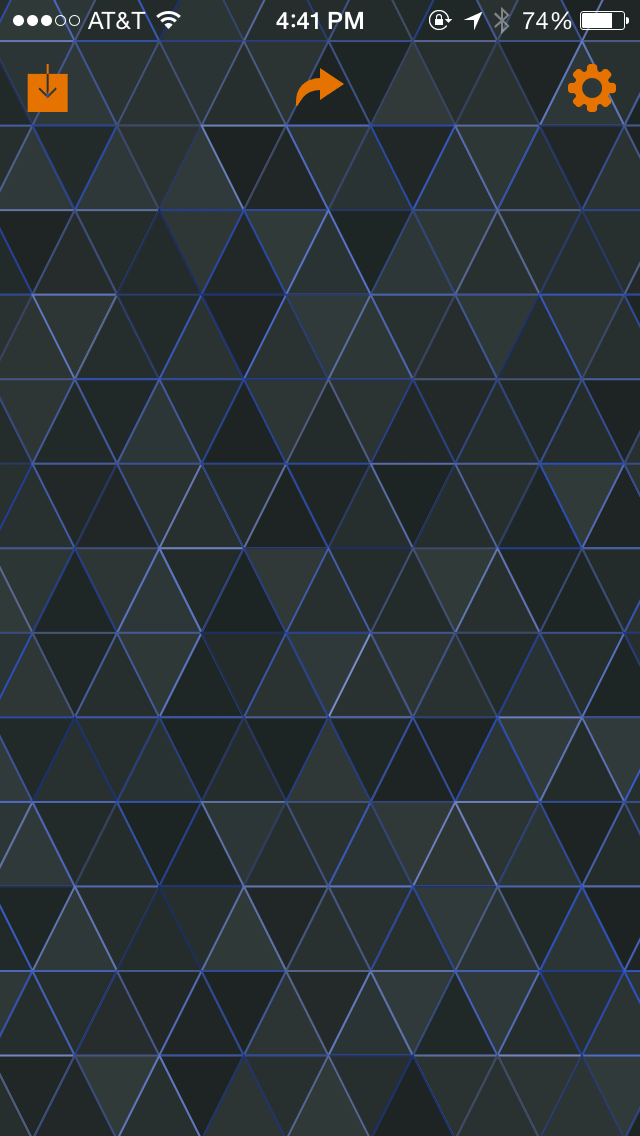
So, as a kind of joke a few weeks ago, I thought, self, let’s make an actual wallpaper with our silly little algorithms. So I did that! And once I did, I realized, hey, these aren’t actually that bad. So I made a few more. It started as just squares, but quickly moved to triangles and diamonds and hexagons and. . .wowsers. After a few hours of hacking and twiddling, it was actually making some pretty neat, usable, dare I say it attractive things.

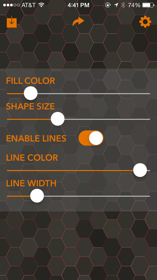
So I kept at it. Maybe 24 hours, wall-clock time later, I actually had something that a few people wanted to play around with which, well, is why I’m here! I think my wallpaper silliness (yes, that is the actual project name) is pretty much done, so I’m gonna put up some screenshots. This’ll be free with silly IAP, but no limits on saving or making wallpapers. I haven’t decided on the full list of sliders and modifiers yet, but I’m getting pretty close to calling it good.
I hope people like using it! I’m already using some of the stuff it’s spit out, so I figure that’s a pretty good sign already. And, hey, if people really seem to like it, I’d be tempted to do an OS X port. Shoot. Never done that before, have I?